Interview

7 min read


As we have progressed in our goal for growth here at Tappx throughout these 9 years in the market, it has become clear to us that we had different business units in our portfolio that altered the perception of Tappx as a mobile-centric brand. So much so, that we realized we needed to explore a new brand architecture.
To this end, in mid-2021, we planned a project based on 6 stages of work involving 5 specialist service providers in each of the areas (the scope was such that some of them even confessed that it seemed crazy to think it would be possible to work with so many different providers).
In any event, the 6 stages of work consisted of:
And we developed them as follows.
In this first stage, the objective was to define the value proposition, the story, and the new brand architecture. To get a more realistic view, we hired Jordi Torrents and his team at Collaborabrands who helped us to:
This is how we discovered that what we are valued for is our human team and our way of working. People and culture.
The team is the most powerful asset today. It was highlighted in all the interviews and is transversal to the company’s different targets. In relation to the team, in particular, the following stands out:
Among the testimonials and evaluations that have been shared with us are that “Tappx is my favorite client, they are very hardworking, friendly and always there” and this one which states “Account managers very friendly, helpful and supportive”.
In terms of culture, our working methods and understanding of the sector are valued. We are perceived as being a partner to the client on many levels:
To this end, several opinions have been shared with us: “The customer service is very friendly and they try to resolve questions in the best possible way by giving several possible solutions. We always come to good agreements”; “Great team to work with. They’ve always felt like a partner”; and also “the Tappx culture is the most important thing in the company”.
At this stage of the work we also define:
Early recommendations pointed in the direction of an umbrella brand where the main brand protects and endorses other brands in the group or portfolio. This is an ideal model for diversified companies or those with many product categories, and perfect for moving into new product categories that are different from the current one.
With these findings and early recommendations, I progressed toward the idea of building a new corporate brand from a transversal and horizontal perspective – not hierarchical – that reflected the attributes common to all brands. For this, I thought of hiring Fernando Beltrán, who, for me, is the Norman Foster of words.
The corporate brand had to be our best home and, for this, it was worth finding the best architect. That’s why we hired Fernando Beltrán who, for me, is the Norman Foster of words.
When you choose the best, you don’t hire him to do what you want. Otherwise you might as well do it yourself. When you hire the best, you want him to do it the way he knows best. That is why I humbly presented him with a non-briefing, accompanied by all the information we obtained in the research phase. Rather than an instruction to find the name of our corporate brand, it was a wish list.
Among them were two main wishes:

When establishing the verbal identity, one of my obsessions was to build a self-perpetuating virtuous circle of renown inspired by “Intel inside” or “Polo con ziritione”.
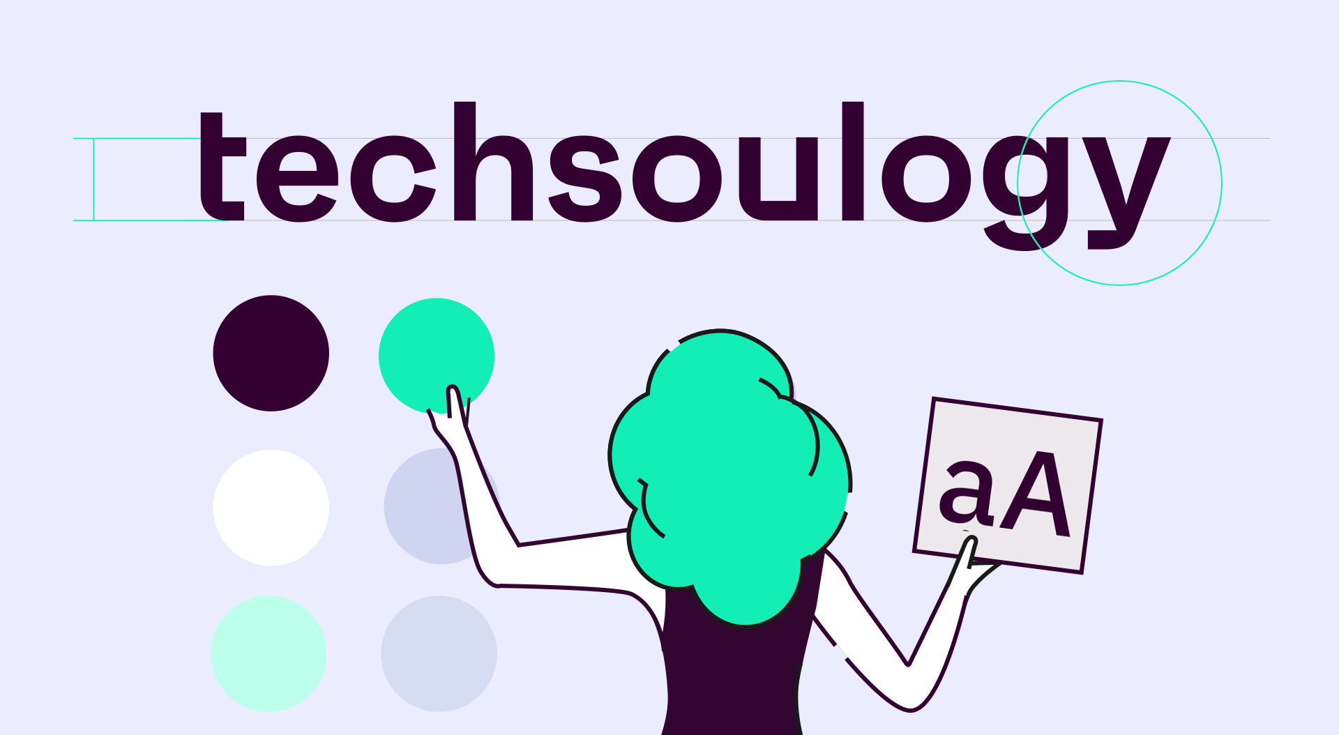
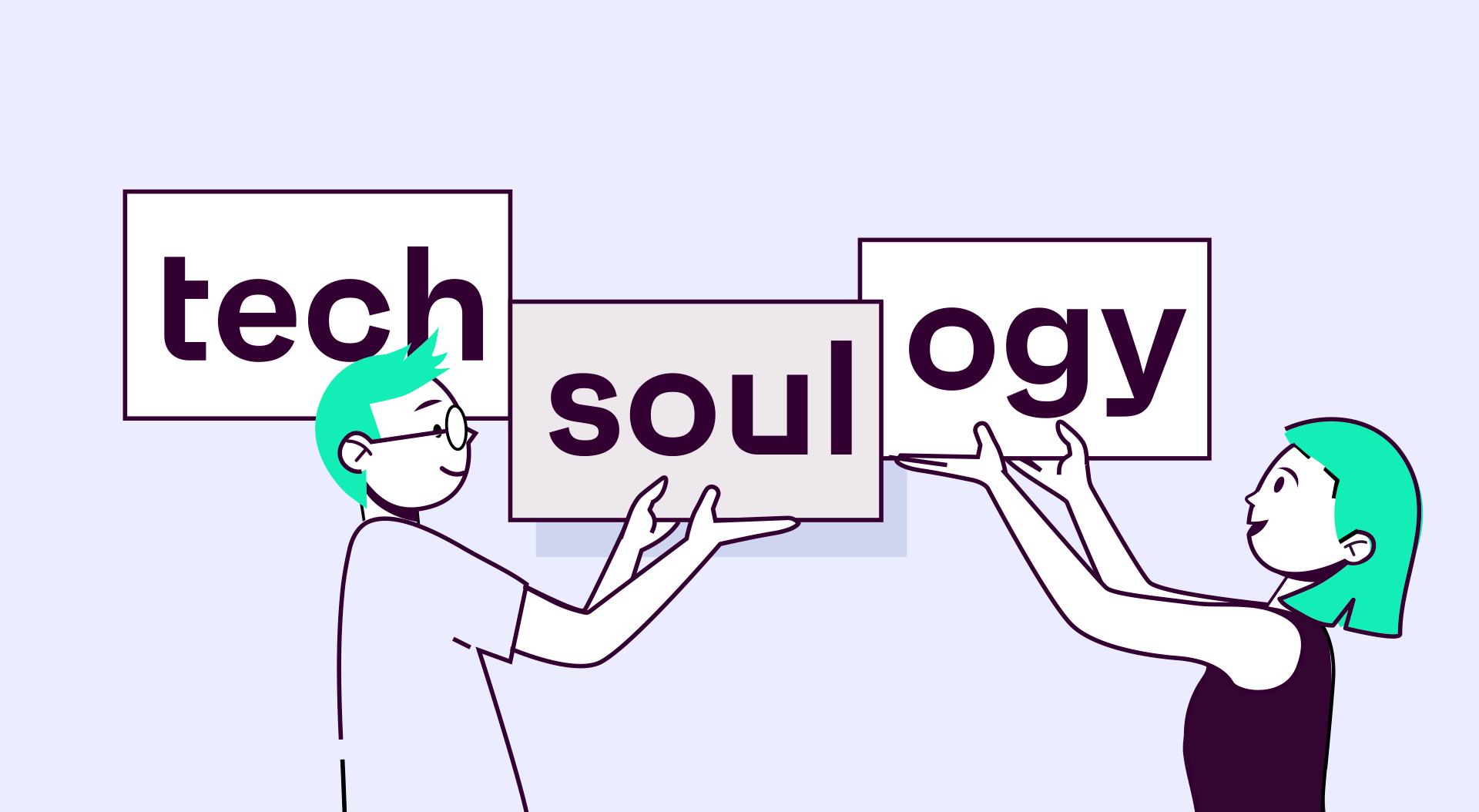
To do this, we collaborated with Fernando Beltrán to find a word that would describe our method and make visible the values and transversal attributes of our best-known brand so far – which was Tappx – moving those attributes horizontally to new brands while it gained renown for itself. How does the flywheel work?

It is an awareness engine to:
More in-depth:
The objective of this stage was to visually connect with our story and thus be able to deploy a visual language that allows us to coherently build current and future brands. At this stage, the assignment was:
For this, we relied on the Comuniza team led by Ricardo Domingo, responsible for project strategy, and Adrià Romañá, responsible for the design. In its own words, the Comuniza team created “a visual code that respects the identity of each brand, but at the same time evolves them by humanizing them”. All while “ensuring that each brand can create shared assets, streamlining the design process in a scalable way with this system” so that we save time and gain flexibility when it comes to designing icons, illustrations, presentations, websites, physical promotional material and other resources.
The visual system design consisted of selecting a route and establishing rules for:
Once the visual identity manual was delivered, we set to work.
Our in-house design team, Javier and Marcelo, took over to nurture the brands.
“From the time we received the visual identity manual designed by Comuniza until the launch of this new architecture, we have taken 5 months to build 6 brands with their corresponding logos, visual codes, illustrations, icons, and videos. At all times respecting the coherence and consistency emanating from the umbrella brand Techsoulogy”, Javier explains. “Without this prior visual identity work, we would have taken twice as long, or even three times, with a much less fine result. For a designer, it is a pleasure to be able to work with these basic brand guides. I am certain that it will enable us to go places”, he adds.
“Experiencing the defining of our visual identity from within has been an emotional challenge. Many hours of work and creativity are now going through the acid test with the end user, who will be our biggest critic”, Marcelo assures. “My intuition as a designer tells me that the critiques will be positive”.
The digital ecosystem of new websites is built on the foundations of Atomic Design, which is inspired by the chemical principles of matter. In other words, all matter is made up of complex organisms, which in turn are made up of molecules, which in turn are made up of atoms.
Thus, we work in conjunction with agencies Comuniza and Branng to develop our web ecosystem based on atoms with their molecules and organisms (or components), applicable to each workforce to build pages in a more coherent, rapid, and simple way.
This method helps us in the evolutionary maintenance of our properties to meet our goal of forming part of something more universal, bigger than ourselves.
This has been the result of an intense year and a half of work. Streamlining the entire project would have been simple if we had simply opted to create a new logo in Paint. However, in order to go much further – which is what we have managed to do with this process – it has been necessary to actively collaborate with more than 20 professionals with a variety of expertise. They include the members of our marketing team Javi, Marcelo, Raquel, and Akvile Paldauskaite; collaborators required within the company, including Dani, Toni, Judith, Alberto, Linh, Carla, Pat, Héctor, Kinga, and Aitor; and external specialists such as Jordi, María Fernández, Fernando, Ricardo, Adrià, Juan, and a long list of clients and stakeholders. To all of you, and you in particular if you are reading this, thank you, and welcome to this new journey. We have a feeling it will be very exciting.
Subscribe to our newsletter
![]()
Important Security Notice
Beware of scammers impersonating Techsoulogy brand
We have identified fraudulent activities where malicious actors are imitating Techsoulogy assets. These scams may compromise your security.
⚠️ Warning: The URL you came from has been flagged as potentially harmful.
To stay safe, only trust communications and services from the official Techsoulogy domain: techsoulogy.com