


5 min read

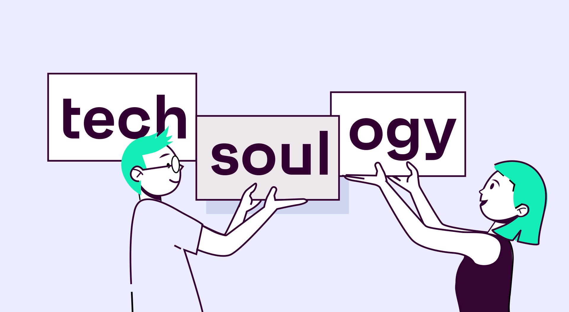
Evolve without losing the characteristic identity of the brand by humanizing the role of technology through design. This is the challenge that the branding and innovation agency Comuniza faced when we asked them the new visual identity of Techsoulogy brands. A project in which they have worked in record time and now passes its trial test: the presentation to the end user.
We chat with Ricardo Domingo, responsible for project strategy, and Adrià Romañá, responsible for design, about the making of the new visual identity of Techsoulogy’s brands.
Let’s go back in time and start at the beginning. Ricardo, tell us about the assignment our CMO, Fernando Saiz Camarero, gave you a year and a half ago.

Ricardo: Fernando contacted us with the humble goal of changing the world. He wanted to create a visual system that would relate to all brands without losing commercial presence and, to top it off, that would be easy to use and be capable of being spectacular. In other words, the complete package. However, when a client literally says “carry out the project that you would feel proud to present” a certain something runs through your body and you end up accepting the challenge. Afterwards, like in the great Himalayan expeditions or Shackleton’s trip to the Antarctic, you have it all: from the vertigo of the challenge, to the excitement when you get closer to the goal and see you can achieve it. Now, from the sofa at home, if you ask me, the answer is Yes. I would pack my backpack and do this journey again.
5 different suppliers, 6 brands, a highly competitive sector… Why did you take on this madness?
R: Being part of the process is usually a real hassle because information gets lost and the end result is often not the optimum one. However, in this case, we have to be grateful for the good work of the other suppliers, the transfer of information has been good and it’s clear that we have all tried to give the best of ourselves to achieve the best result possible.
The challenge was, among others, to humanize the role of technology through design. Adrià, from where do you start working on such a project?
Adrià: The project came to us with that key challenge well-defined. The approach required was clear, to humanize technology, to make people aware that Techsoulogy are people providing a service through technology. The launch of the project was very good, we were able to do a workshop with the team involved from Techsoulogy, enabling us to focus better on the desired result. Shapes, colors, typography, photography, being able to address these issues with the team helps us a great deal in defining the behaviors in order to find a solution that meets the challenge, helps the brand and the people that are going to be using it.
Has the naming created by Fernando Beltrán made things easier for you?
R: The name refers to two concepts that represent the new corporate brand perfectly. Technology and soul (people). It is a name that swims upstream, by extension, but that is perhaps why it describes the company and its DNA so well. It was, without a doubt, a great material to work with.
And Jordi Torrents’ strategic definition?
R: The most monolithic behavior provided by Jordi’s team is extremely logical in a setting where operational efficiency makes more and more sense and where the brand’s value proposal wants to go beyond the provision of a product or service to take on a wider meaning related to the whys and wherefores of the company’s activity.
We would love to know about the making of the visual code within Comuniza. How did it emerge, how is its intentionality and scalability built… What is the key so that in 5 years it won’t be an outdated design?
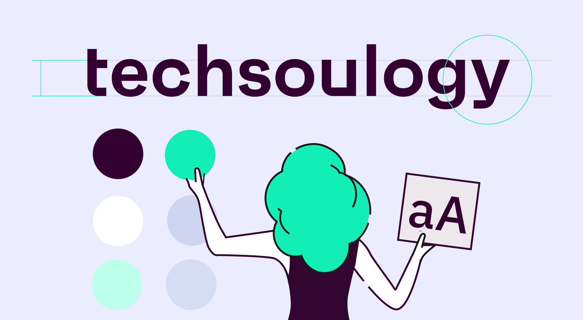
A: From the visual point of view for the identity, we used a broad color palette with a highly digital focus, which retained the technological essence, together with a sans font with a technical nature and also highly digital. To convey the human part, we opted for a code of shapes and a construction of more humanized pieces, geometry mixed with organic traces, and a strong presence of photography with one key point: people. But the rest didn’t all consist of the expressive side of the brand. We searched for a scalable visual code that would enable the brand to generate others with the same patterns. We looked for a palette which, in addition, had a common behavior and colors that could be expanded to new brands. We set some guidelines for the construction of new logos, of shapes that would be encompassed within the same family. In summary, we determined a broad visual code, which wouldn’t limit the brand but would always give it a path to follow. That way, we guaranteed the capability to adapt to spaces, formats and time.
Another interesting point is the architecture of the new websites and how to order the large amount of information based on different types of users and search intentions. Adrià, do the first Figmas have anything to do with the result that we now see “live” in the 6 webs? What was the challenge here?
A: If the visual challenge was big and clear, the challenge for the construction of the websites was perhaps even more so. We started with a few long workshops to structure content and properly define the structure of the information, in addition to starting to play around with the possible wideframes for the home pages with the team. We achieved a good result, a starting point to define the rest of the behaviors and pages.
The challenge on the websites was to obtain an easy, agile and scalable ecosystem which, like the visual code, could be adapted to generate new brands. We worked on Figma, designing modules that enabled practically endless pages to be built, combining these modules for different uses. The design work and use of the collaborative tools enabled us to come up with the result which is almost identical to the one we see now “live”, a scalable ecosystem that adapts to the different content and information of each brand.
To reach this final result I imagine there has been a lot of research, trial and error. Can you tell us what have been your sources of inspiration for both the visual identity and the design of the Techsoulogy brands?
A: From the very moment the project reached Comuniza, we started to soak up other brands and visual languages. Sectors that are having visual success cases as well as technological success cases, digital products, but also closer and more human brands. It’s clear that we have a lot to be inspired by, but that’s why the visual workshop with the team involved from Tappx also helped us a great deal in order to see what truly inspired them.
The development time of the whole project never ceases to amaze us. What do you think has been the key to achieving something of this magnitude in just a year and a half?
A: Having a clear focus in terms of the new brand’s goal and also about the digital ecosystem for the websites has helped us a lot in achieving the result. But, without a doubt, the mutual understanding between the two teams and with production has sped up the project, enabling us to move forward in all fields that we have worked on in a very agile way.
Are you happy with the result? What would you say is the jump in value for the brand with this new design and visual identity? How far can we go?
R: It has been a pleasure to take part in the project and to be in contact with the Tappx team and the other suppliers. We believe that the redesign of brands moves the group closer to the idea of being an ecosystem of technological brands that place the customer at the center. The visual language we have created will help to scale the different brands, maintaining consistency and coherence of the graphic line. That’s why we like to talk about a vivid language that we create, but that Tappx will continue to develop in the future.
A: We’re very happy with the result and also with the process we went through to get there. We believe that the new visual identity will give the group a strong ability to group its different brands under one umbrella, consistently and easily in order to adapt to different supports, formats and content for each one. All of them have their own personalities and link to the group. With this type of visual language, we are seeking a starting point which, within certain guidelines, can develop alongside the group.
Let’s have a quick round of questions about the before and after. How much has the site gained in usability?
R and A: We think a lot. A clear focus when it came to approaching the project was in gaining usability, both for the user when navigating the website, and for the group when generating an ecosystem based on modules and tokens, scalable.
And in user experience?
R and A: As I said before, we considered both the architecture of information and the construction of the modules so that the navigation was easy and understandable for the user. We believe that the websites now enable users to navigate them more fluently.
If a new brand emerges within the group tomorrow, how long would it take to create its visual identity and website?
R and A: Just as we have considered the identity and the websites, we have ingredients that enable us to create new brands and their websites in record time, using the visual code guide and the modular web ecosystem.
Will Google like the result?
R and A: Of course. We have always taken SEO into account, an essential requirement when setting up any website.
And the end user?
R and A: Even more so. We believe the new code and websites help the brand to place its users at the center, making the brand more human. Users are bound to be delighted.
And whoever is in charge of uploading the content?
R and A: The inner workings of the ecosystem are designed to be just as equal as their “front”. Tokenized fonts and colors that enable scaling to be done quickly, flexible pages with modules that adapt to different content. Adapting to any content is going to be simple.
What would be the best review you could receive?
R and A: Knowing that what we have created works, that using the new identity and web ecosystem is easy and that it streamlines and saves time for the team.
And who would you like to be compared to?
R and A: More than being compared, when people see the new group and its brands, that they think of a big company but with the heart of a small one.
Did you learn anything from the process?
R and A: Lots of things, but to mention one, working with the customer as a team. When we started talking about Tappx from the “we” perspective, we knew things were going to turn out well.
Last but not least, did you enjoy the work? (Say yes, please haha).
R: We’ve had fun, a lot of fun. We don’t always get to work with clients that want to take risks and that push us to go even further. It’s been a pleasure and we are sure that, with this project, the group is much closer to achieving its goals.
A: It has been a real challenge, but we have had fun along the way. And, of course, the result too! We believe that with the work the group has carried out, it has excellent tools to tackle the future.
Subscribe to our newsletter
![]()
Important Security Notice
Beware of scammers impersonating Techsoulogy brand
We have identified fraudulent activities where malicious actors are imitating Techsoulogy assets. These scams may compromise your security.
⚠️ Warning: The URL you came from has been flagged as potentially harmful.
To stay safe, only trust communications and services from the official Techsoulogy domain: techsoulogy.com

